
Watercolor glazing. It sounds so exotic.
Really, it is just layering washes of transparent color on your paper. The trick is in choosing your colors well because not all colors are equal in transparency.
I've haven't been too happy with the results that I get with my Koi paints and decided to focus on glazing for a while. I don't like doing charts, so I did a couple of paintings.
The first is inspired by Robert Burridge's pears. He works in acrylic, and I'm not attempting to emulate his style, but I love this little video he did, showing how easily negative space can become a focus. I'd been thinking about that for some reason, and decided to use negative space that way in my glazing exercise.

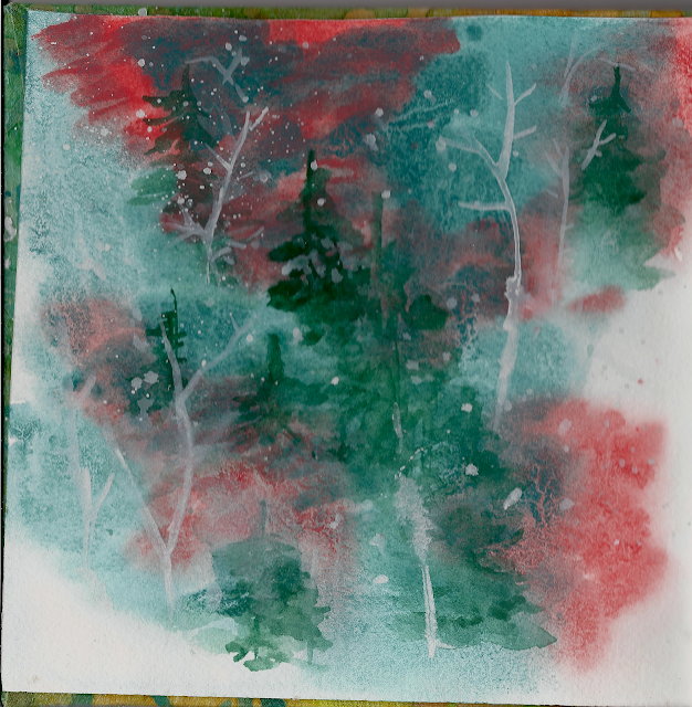
Then I did an exercise from 'The Tao of Watercolor' by Jeanne Carbonetti. I didn't have any of the colors she called for, so I attempted to mix them as closely as I could. My 'turquoise' got a little muddy, lol!
This is the first painting I've done on Arches 140 lb paper. My washes are much juicier, but I also get more backwash. *sigh* No good thing comes without baggage!
This is also the flyleaf from my first attempt at bookbinding! I'm not too unhappy with it, except that my cutter had a terrible time getting through the 140 lb Arches. The squares ended up more like diagonals. But--now I know where my problems will be the next time.

This is so great..love, love it. Sometimes 'Extra Time', gives you the moments and space to do what you want and are passionate about. The road is mostly bumpy and long...then you turn the bend, there it is and you are gifted with the ability to share it through your artwork.
ReplyDelete