
This is the first post of my review for the Stillman & Birn Epsilon Sketchbook.
 I was in North Carolina last week helping my brother with a seminar and giving a presentation on Social Marketing. The seminar, a Writer's Camp, was held on his farm, and the people who stay there bunk down in pretty rough & rustic cabins, making it a bit like camping. I wanted to travel light because I wasn't sure how much room I'd have.
The only art supplies I carried were my Epsilon Sketchbook, a Pentel White Sunburst gel pen and one of the Zentangle® Micron Pen sets made by Sakura.
I precolored a few pages in this Sketchbook, with Spectrum Noir markers, so I could do some Bleedthrumanades (Got lemons? Make lemonade. Got marker bleed-thru? Make Bleedthrumanade.)
I'll have at least one more post with the Epsilon that will feature work done with other media.
The Specs:
Color: Natural White
Weight-100 lb (150 gsm)
Surface-Plate surface for Pen & Ink (very smooth)
Look & Feel:
I received the 6x8 in (15.2 x 20.3 cm) size. Stillman & Birn, sent me four of the Stillman & Birn sketchbooks shortly before I was due to leave (you can see the Comparison here). I had reviewed the Delta Series Sketchbook a few weeks ago and chose the Epsilon to take, because the paper was the most different from that of the Delta.
The paper borders on look and feel of cardstock. It is smooth and bright but not glossy. Alcohol marker color is brilliant in it. The paper color--natural white--is the same as for the Alpha and the Beta series, but it seems whiter too me, probably because the other books have a rough texture.
As with all the series, the cover is a textured black over extra heavy weight binders board. I received one of the double wire-coil formats. The holes for the coil are a bit large. If the sketchbook is carried in a purse or bag, I think the paper around the coils might eventually rip.
Performance:
 Because I used the Pentel White Sunburst gel pen heavily on the front (to the left) and went so heavy with the black on the back, the color appears almost as solid on both sides. In fact, color bleed-through is only about 75%-80%. There is some feathering when the alcohol marker is applied, but you can get a crisp line if you move quickly. I like to let my colors blend so I don't worry about it.
 I experimented quite a bit with this one. I only used shades of gray Spectrum Noirs, and then used the blender marker. I really like the effect, and haven't done anything further on the front. I intend to add color to this with other media, but thought you might like to see it before I do (plus I worry I might ruin it!).
On the back, I used one of the stamps from Viva Las Vegastamps! that was created using my artwork. I used the steps to my tangle pattern 'Sabal'. I loaded the stamp with ink, and stamped three times without adding more ink. The bottom has the darkest ink, and the top barely shows the design.
Since the ink color is a little different than my pen color, I darkened some of the bottom image with the pen so it would blend. I added details to the second image that changed the pattern altogether (and blended to the two colors of ink). Then I added various patterns and shading along the sides and top. I think it looks like an underground grotto reflecting in a lake, lol!
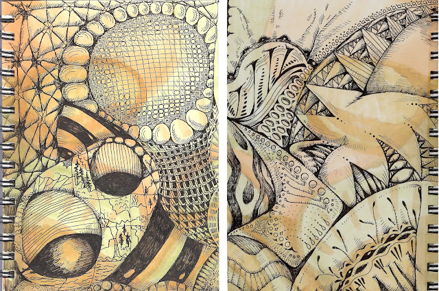
Alcohol marker color is bright but not brilliant. The linework from the Microns was crisp, but not as bold as I thought it might be. It is bold enough, and a good solid black is possible, but I had to work a little harder than I thought I would. I actually prefer that, because I like lots of tone variation for shading.
Part II of this review (and a new tangle pattern too!) can be found here.

The only art supplies I carried were my Epsilon Sketchbook, a Pentel White Sunburst gel pen and one of the Zentangle® Micron Pen sets made by Sakura.
I precolored a few pages in this Sketchbook, with Spectrum Noir markers, so I could do some Bleedthrumanades (Got lemons? Make lemonade. Got marker bleed-thru? Make Bleedthrumanade.)
I'll have at least one more post with the Epsilon that will feature work done with other media.
The Specs:
Color: Natural White
Weight-100 lb (150 gsm)
Surface-Plate surface for Pen & Ink (very smooth)
Look & Feel:
I received the 6x8 in (15.2 x 20.3 cm) size. Stillman & Birn, sent me four of the Stillman & Birn sketchbooks shortly before I was due to leave (you can see the Comparison here). I had reviewed the Delta Series Sketchbook a few weeks ago and chose the Epsilon to take, because the paper was the most different from that of the Delta.
The paper borders on look and feel of cardstock. It is smooth and bright but not glossy. Alcohol marker color is brilliant in it. The paper color--natural white--is the same as for the Alpha and the Beta series, but it seems whiter too me, probably because the other books have a rough texture.
As with all the series, the cover is a textured black over extra heavy weight binders board. I received one of the double wire-coil formats. The holes for the coil are a bit large. If the sketchbook is carried in a purse or bag, I think the paper around the coils might eventually rip.
Performance:


On the back, I used one of the stamps from Viva Las Vegastamps! that was created using my artwork. I used the steps to my tangle pattern 'Sabal'. I loaded the stamp with ink, and stamped three times without adding more ink. The bottom has the darkest ink, and the top barely shows the design.
Since the ink color is a little different than my pen color, I darkened some of the bottom image with the pen so it would blend. I added details to the second image that changed the pattern altogether (and blended to the two colors of ink). Then I added various patterns and shading along the sides and top. I think it looks like an underground grotto reflecting in a lake, lol!

Alcohol marker color is bright but not brilliant. The linework from the Microns was crisp, but not as bold as I thought it might be. It is bold enough, and a good solid black is possible, but I had to work a little harder than I thought I would. I actually prefer that, because I like lots of tone variation for shading.
Part II of this review (and a new tangle pattern too!) can be found here.
great review :)
ReplyDeleteThis is so beautiful. I enjoy seeing your work. It is so unique. TFS
ReplyDeleteThank you both!
ReplyDeleteso amazingly beautiful how your drawings flow flawlessly taking me in a trance...thank you for sharing
ReplyDelete