
Tiered Fantasy Landscape Step-by-Step #FantasyLandscapeStepOut #FantasyLandscape #FantasyLandscapeStepByStep
The tools you'll need for this step-by-step:
- A pencil
- An eraser - a good plastic or kneadable eraser would be best.
- A pen - Any pen will work. If you intend to watercolor after drawing, use a waterproof inked pen. I use Tombow's Fudenosuke hard tip brush pen or Pigma Micron. Both are water-proof, but the Fudenosuke must dry a while first.
- Paper. I recommend at least 5 x 7 inch. You may want to go larger depending on whether you intend to tangle or color it when you are done.
The second reason to use portrait? To draw a tiered landscape, where there are sections separated by roads, rivers, fences or walls. Tiered landscapes are great for people who like to draw rows of the same object.

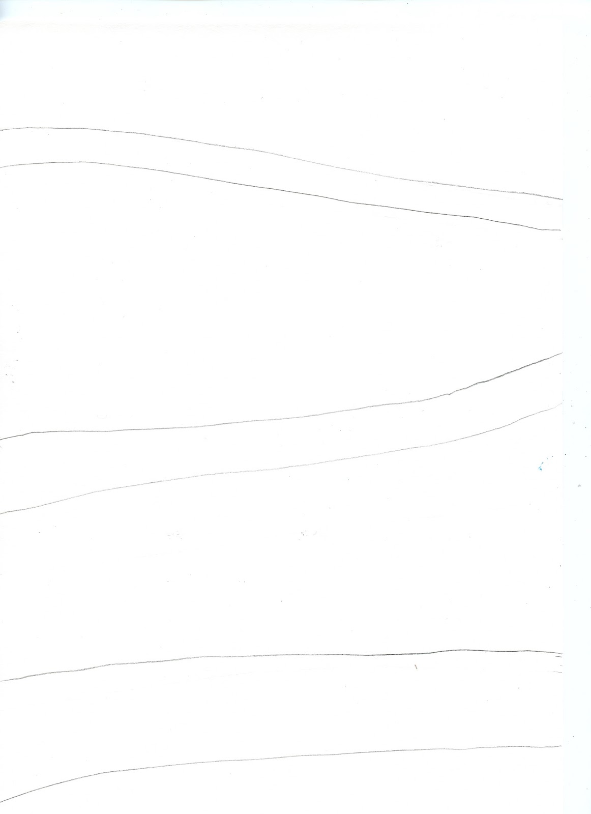
As I sat down to write this step-by-step, I realized that I should have introduced roads first, but I'll do that later. For today, we are using Striped Roads, which cut your landscape into sections.

Tiered Fantasy LandscapeStep-by-step
For my step-by-step example, I decided that I wanted something more open than my first example, and a composition that moved from side to side rather than having rigid tiers as I did above.
The first thing to do is to pencil in the lines where your roads will go. This gives you a guide in placing objects, but allows the necessary overlapping. In fact, you might want to do the whole drawing in pencil first (you'll see why that's wise as we go further on).
The object closest to the viewer (other than the lowest road) is this Tall Tree, so it is the first thing drawn. Note, the extra branches in the tree. I'll discuss that further, below.

I mentioned that this drawing will be more open than the first example. I'm going to do that by having fewer objects.
But I want the drawing more open, not just simpler. So I'm adding fewer objects but more detail lines and making the relationship between objects more complex. Here, I added more branches to the tree, and more complexity between the trees by having the wall in between them.
Guide Rule: In a crowded drawing, have more objects, less detail and less complexity. In a open drawing have fewer objects, more detail and more complexity.
Now - that line of grass. I was tempted to tell you that I intended to show you the value of drawing everything in pencil first. The truth is I woke up stupid this morning. It happens to us all, so I thought this was a good time to address it.

Before I address the problem, though, I'll talk about the second rock wall. I mentioned that I wanted a side to side flow, and I want to start establishing that flow. I knew where my chicks would go, and that the wall wouldn't interfere.
I didn't draw the wall on the lower left, because I wanted the eye to jump up to middle wall.

So what was the problem with the grass?
I wanted two more trees in the lower left.. While drawing the second wall was planned, the grass was in the way. I managed to slide the trunk of the second Tall Tree into a gap in the grass, but my Who-lee Tree is much shorter than I wanted. The moral of the story? I'm not as happy with this drawing as I might have been, but probably no one will would have noticed, if I hadn't just told them. Drawing with pencil first helps with planning, but if you make this kind of error, just keep drawing. It will work out.

I added the Chicks, drawing five instead of eight. Notice that I chose to have two standing in the road, and two that overlap. Fewer objects, more detail and more complexity. The chicks also aid in the side-to-side flow by drawing the eye up toward the second wall.

In my Tall Portrait Fantasy Landscape step-by-step, I talked about the weight of values (dark and light) and using them to help balance the landscape. Since I had the dark values from the Who-lee Tree at the bottom right, I felt the need for some dark values in the middle and chose to draw more Who-lee Trees.
I also decided to leave out the Petal Plants and the Hummingbird to reduce the number of objects.

I drew another line of grass, which was planned. However, I then had a new idea, which I felt would work better, but would make the grass a problem. Again.

My choice? I was going to draw the two Who-lee Trees, and draw Popcorn trees as I did in the first example, just fewer of them.
My new idea was to draw Flowering Artyjokes at the top and one Popcorn tree behind the Who-lee Trees. Both of those objects have little 5-petal tips, which would echo each other, and help draw the eye up again.
Did I confuse you by adding a third tree to the middle?
That does seem to break the rule of fewer objects, and it did mean I had to draw a tree that was shorter than I liked. But it allowed for fewer objects at the top, and increased the complexity of the relationship between the top and the middle, because the petal tips echoed each other.
This is why art isn't easy. Rules work until they don't. An artist has to make choices and take chances. I didn't break my rule for the drawing overall, but I did bend it for the middle section.

To finish I drew in the roads with pen. In the first example, the roads provided white space between the crowded sections. I decided to darken them to get the opposite effect in this drawing. Note that I made fewer lines in the top road because it is farther away, and you can't see details as well from a distance.

Even though I said I was finished, when I looked at the drawing later, I felt there wasn't a real focus. The three sections had about the same weight. The top had fewer objects, but was darker in value. The lower and middle had roughly the same number of objects and about the same values. I thought it would be of interest to make the middle area the main focus and decided to do that by totally breaking my rule. I added a couple of Starbushes which added more objects, but also increased the complexity of the overall drawing.
So now I have a drawing that is simpler than the first example, but less open than the second drawing. I didn't really break the guide rule that I established - I changed the game.

Some things to think about when deciding between a crowded or an open drawing.
- If you plan to add shading, then less complexity might be better.
- If you plan to add tangle patterns then the fewer objects and less complexity the better.
- If you plan to color either way would work.
Your fantasy world may differ. Can you think of other reasons why you might use a Portrait orientation? Please leave a comment if you do. I'm interested in knowing and suspect my other readers may be as well.
Next Friday, I'll have a step-wisely for you showing the three different roads you'll find in my fantasy world.
Gran y útil artículo por cierto. Gracias.
ReplyDeleteExpediente Orden Protección VA