
Today's step-by-step focuses on using basic shapes to create your fantasy landscape. Instead of comparing two different examples, I'm sharing an example all the way from my first steps of creation to the finished piece in color.

SUPPLIES
Paper: This was drawn in my emnotes notebook. The paper is similar to printer paper.
Ink Pens: Tombow Fudenosuke hard tip, Graphic Micron and Pigma Micron sizes .03 and .05
Color Marker Pens: Tombow Dual Brush Pens. These pens have a brush nib end and a pen nib end. They are water-soluble and can be wet to use like watercolor. For this drawing, I only used the brush nib and did NOT add water.
For a full list and links to Fantasy Landscape Step-outs, Step-by-steps, Step-wiselys and guide rules go here.
Step 1: Work out the composition, values and shapes
I'm not good at just visualizing what I want to draw and then drawing it. So I start by just messing around with a vague idea in mind, not worrying about any rules or techniques. Usually after 10-15 minutes of drawing, I have a pretty good idea of what I want. Then:
First I penciled in the cliffs, so I'd know where to place everything else.
Then I drew the Flipple plant. It loans itself to curving and I curved it to point toward the area between the bear and the bird. I knew where that was because I had penciled in the cliffs.
I'm playing fast and loose with my lighting and shading in this piece. I'm worrying more about how the values move the eye than whether they are in the correct place for realism.
Step 3: Color the Drawing
Okay, back to the step-by-step.
Next I used Dark Olive in the bushes behind the bear and along the cliff. I used the same color in both places, but notice the difference in color. I did scribble when coloring the bushes, allowing yellow to show through, but the Dark Olive is semi-opaque, so the color underneath has more affect.
To finish off, I used Dark Plum over the Dark Olive to get my darkest values, and notice how it turned almost black and doesn't really look green at all. That's opacity versus transparency.

SUPPLIES
Paper: This was drawn in my emnotes notebook. The paper is similar to printer paper.
Ink Pens: Tombow Fudenosuke hard tip, Graphic Micron and Pigma Micron sizes .03 and .05
Color Marker Pens: Tombow Dual Brush Pens. These pens have a brush nib end and a pen nib end. They are water-soluble and can be wet to use like watercolor. For this drawing, I only used the brush nib and did NOT add water.
- Colors used: Pale Yellow, Chrome Orange, Orange, Sand, Glacier Blue, Periwinkle, Orchid, Deep Magenta, Dark Plum, Dark Olive
For a full list and links to Fantasy Landscape Step-outs, Step-by-steps, Step-wiselys and guide rules go here.
Step 1: Work out the composition, values and shapes
 |
| Scan 00-Mock up original for tracing |
- Using a pencil, I experimented until I had my shapes, values and a composition that works for this step-by-step.
- I used the Fudenosuke hard tip to draw the shapes, the Pigma Microns to draw the details and the Graphic Micron to fill in the large dark areas.
- This first drawing wasn't quite right for what I wanted. But it told me this:
- The focal point of the drawing should be the space between the bear and the bird
- because they have faces and are of the most interest.
- The peacock plant was too dark and didn't lead the eye anywhere.
- The texture and detail was far too complex for the Fantasy Landscape series.
- I came up with a texture on the cliffs that is new to me - I like it.
- This drawing was good enough to tell me what I needed to do for this step-by-step. Time to move on to step two.
Step Two: Trace and scan the drawing
Using my initial drawing, I traced each object on the page, a section at a time, scanning before I moved on. Time consuming! I traced the sections in the order that I originally drew them so they would overlap properly.
 |
| Scan 01-Pencil in Cliffs |
First I penciled in the cliffs, so I'd know where to place everything else.
 |
| Scan 02-Draw Flipple Plant |
Then I drew the Flipple plant. It loans itself to curving and I curved it to point toward the area between the bear and the bird. I knew where that was because I had penciled in the cliffs.
 |
| Scan 03 |
After adding some general detail in the form of poodle plants, I inked in the first cliff. Notice the overhanging grass and how the complexity in the cliff detail is greater on the inside edge. I did this as a subtle way to move the eye toward the middle cliff.
I'm playing fast and loose with my lighting and shading in this piece. I'm worrying more about how the values move the eye than whether they are in the correct place for realism.
 |
| Scan 04 |
I drew the peacock plant first. In my original drawing I drew it too large so that it ended up going off the page and so that the left edge is almost exactly in line with the flipple plant. These are both errors in terms of composition. I meant to change it as I did my tracings and I forgot. Rather than start over, I decided to keep it so you can see how this leads the eye off the page. The fix would be to make the plant smaller so it clears the edge on the right and falls a bit below the flipple plant on the left. The path for the eye was meant to be that you'd follow the flipple, fall down to the corner of the peacock where the points would push you up to the bird.
 |
| Scan 05 |
Now I added the bird, which is one of the items with the most interest in this drawing. I also added some filler detail in the form of more poodle plants. If you wanted to keep your drawing really simple because that is your taste or you intended to add tangle patterns, the poodle plants are the kind of detail you would leave out.
 |
| Scan 06 |
I inked in the cliff, repeating the overhanging grass and complexity of cliff detail pointing to the third cliff.
 |
| Scan 07 |
Now I added the bear, the most important object in terms of interest.
 |
| Scan 08 |
I wanted lots of contrast around the bear and to push the viewer's eye back toward the bear, so I added a greater amount of detail and texture with lower interest value. The plants could either be poodle plants or scribble plants. I already know that I will scribble in texture with color so I'm calling them scribble plants.
 |
| Scan 09 |
The wide open space in the upper right seemed to draw the eye off the page, so I decided to add bell plants flowing down toward the bird and framing the bear.
 |
| Scan 10 |
I finished the line drawing by inking in the third cliff. Each cliff is its own section and each has similarities-the overhanging grass, the poodle/scribble plants and the cliff details. But each section also has a unique focal point. The plants on the lower and middle cliff lead the eye toward the next cliff, while the plants on the top are more of a block, sort of bouncing you back toward the bear.
When you look at the drawing at this stage, it probably seems flat and a bit crowded. Even though I've created some flow and framing to lead the eye around the drawing, there is so much going on and so few value changes that the drawing is confusing.
When you look at the drawing at this stage, it probably seems flat and a bit crowded. Even though I've created some flow and framing to lead the eye around the drawing, there is so much going on and so few value changes that the drawing is confusing.
I'm making a point of this, because I think it is another reason that people are unhappy with their work. This can be rephrased to say, "How can I tell when my work is finished?" That isn't always easy to tell, but if you don't have a contrast in values it probably isn't finished yet.
Now is the time to start thinking about where to place your light/dark values.
Guide rule: Don't judge your work too early, especially if you haven't added contrasting values yet.
 |
| Scan 11 |
Step 3: Color the Drawing
Color opens up a whole new world of opportunity, but there are so many variables that it gets confusing really fast. So before we continue, let's talk about some properties of color.
I'm going to focus on a color's:
I'm going to focus on a color's:
- Value - how light or dark is it.
- Transparency or opacity - how much will show through the color. Will it cover up the lines you've drawn? If you layer it over another color, how much will the color change?
Some information you should know about a color's transparency or opacity:
- Not all similar colors are the same. One red might be extremely transparent and another completely opaque. Navy Blue is much darker than sky blue. It may or may not be more opaque.
- A color can become more opaque/darker the more heavily you apply it. A yellow might become brighter, but not darker or more opaque, but a blue will probably do both and so it goes with all colors.
- Usually the darker the color the more opaque, but not always.
- The paper you are using can make a difference.
- The medium (pen, pencil, acrylic, watercolor, etc) can make a difference, as can the brand of the medium.
- In essence, there are more variables than I could cover in a book. Becoming aware of transparency and opacity is your best tool.
- Transparent colors are usually more expensive. If you buy those cheap Sharpies you'll get dark, opaque colors.
- A medium that goes on light at first makes it easier to control transparency and value. In terrms of controlling transparency, colored pencils are usually the best buy if price is a concern.
Color Glossary:
- Color Family: The group of shades and tints within a pigment's color. Pale yellow and dark yellow both belong to the yellow family, Sky blue and royal blue to the blue family, olive green and yellow-green to the green family, etc.
- Opacity: The degree to which a color is opaque, hiding what is beneath it. An opaque color hides drawn lines. If you layer it over another color, a completely opaque color will not change. A less opaque color may change but only slightly and may not reflect the color underneath. For instance, layering a very dark purple over yellow may simply turn the mix darker. There is a wide range in the degree of opacity among colors, color families and brands. Transparency.is the opposite of opacity.
- Shade: This term may refer to the color of a pigment - yellow, red, blue, etc. or it can be used to refer to a color mixed with black to darken it and dull it.
- Tint: A color lightened by adding white. Pink is a tint of red.
- Tone: A color mixed with gray to darken and dull it.
- Transparency: The degree to which a color is transparent, see-through. No coloring medium - pens, paints, etc. is completely transparent but some colors are more clear than others. A transparent color allows drawn lines to be seen easily. If you layer it over another color, both colors change but the color underneath will affect the change more than it would with an opaque color. There is a wide range in the degree of transparency among colors, color families and brands. Opacity is the opposite of transparency.
- Value: Value is a term in art that refers to a scale of light to dark. You should have at least three values - light, medium and dark, but will probably have more. High contrast between light and dark adds more interest and can create a focal point in your drawing.
For a full list of terms I use often, check out the Fantasy Landscapes glossary here.
If the colors you use are not as transparent or opaque as you like, it could be another reason for unhappiness with your work. But before you rush out to buy something else, try to decide what you are looking for. Do you need something that allows your drawn lines to show through and that changes a lot when you mix the colors? Or are you looking for dark colors that only change slightly when mixed but cover an area boldly and give a stark contrast to lighter colors?
When you see art that you like, consider asking the artist what medium and brand they are using (probably not an artist who is trying to sell their work professionally though), so you know something specific to look for.
Let's keep things simple. I'm using Tombow Dual Brush pens which are more transparent than many brands of marker/pens. I'm going to rate the degree of transparency and value for each color I use on a scale of three - Transparency, Semi-Opaque, Opaque for transparency and Light, MidTone, Dark for value. My ratings will only apply to the color and brand of pen I'm using. This is very rough, because the actual degrees are endless, but it will get you into the ballpark.
| Color | Transparency/Opacity | Light/Dark |
| Glacier Blue | Transparent | Light |
| Pale Yellow | Transparent | Light |
| Orchid | Transparent | Light |
| Sand | Transparent | Light |
| Chrome Orange | Transparent | MidTone |
| Orange | Transparent | MidTone |
| Periwinkle | Transparent | MidTone |
| Dark Olive | Semi-Opaque | MidTone |
| Deep Magenta | Semi-Opaque | Dark |
| Dark Plum | Opaque | Dark |
Okay, back to the step-by-step.
Because it is far easier to go darker than to go lighter, I start with the lightest and most transparent color in my set of Tombow Dual Brush pens - Pale Yellow.
Even though my color is light, I use a scribbling motion and let some white show through. I intend to layer another color and this scribbling will add some texture and variation of color.
 |
| Scan 12 |
I colored the sky with Glacier Blue (Rating: Transparent Light), again using a scribbling motion. After coloring all of the sky, I went back over the areas around the bell vines, the bear, the bird and the peacock plant to up the value/contrast.
Then I added blue to the yellow in the grass (but not the flipple or bell plants), leaving some of the yellow showing. Blue and yellow mixed make green. The grass is darker in real life, because that is one problem with transparent colors. Light reflects through them, and scanners often pick up more of the color beneath than the color on top.
Since I felt that the peacock plant was too dark in my original drawing, I decided to let the sky show through, so I colored the inside part of the pattern.
 |
| Scan 13 |
There are certain color combinations that POP! These are called complimentary colors. Roughly, they are yellow/purple, orange/blue and red/green. As I discussed earlier, not all colors in a family are the same - some yellows are more green than red, etc. and that has an effect, as do value and transparency. After testing the colors of dual brush pens I have I chose Periwinkle and Orange as a combination, and Pale Yellow and Dark Magenta.
I started applying the Orange. I also add Chrome orange to the top patterns of the peacock plant.
I started applying the Orange. I also add Chrome orange to the top patterns of the peacock plant.
 |
| Scan 14 |
Then I added Periwinkle. Yes! My bear is a bluebear! Bluebear meets the Bluebird, lol. I applied more of the Chrome Orange to plant behind the bear to help with framing him. This is the only orange I use in the drawing because isolated colors draw the eye. As it turns out, it wasn't enough but I'll discuss that later.
 |
| Scan 15 |
I wanted to keep the colors of the filler detail light and not as likely to draw the eye. The Orchid was a good choice because it was a nice contrast to the yellow, but similar in transparency and value so it doesn't pop as much as the magenta will.
I wanted the cliffs to be background so I chose a nearly neutral color with overtones of violet, Sand. I applied it using the side of brush nib in long strokes to imply the texture of a cliffside.
I wanted the cliffs to be background so I chose a nearly neutral color with overtones of violet, Sand. I applied it using the side of brush nib in long strokes to imply the texture of a cliffside.
 |
| Scan 16 |
When I added the Deep Magenta, I immediately realized I had made a mistake in my values. From my tests, I thought the Orange/Periwinkle would pop as much or more as the Pale Yellow/Deep Magenta. But the dark intensity of the magenta took over. It would have helped if I had more orange next to the periwinkle. As it is, the first thing your eye is drawn to is the flipple plant.
I considered redoing the drawing, but decided that this is actually the kind of thing I want to show you. Even if you've tested your colors there are enough variables that you can be surprised. This is the kind of thing you want to look for when you are unhappy with a drawing.
I don't think this ruins the drawing and most people wouldn't have noticed if I hadn't pointed it out. But it means I didn't quite succeed in what I was trying to do.
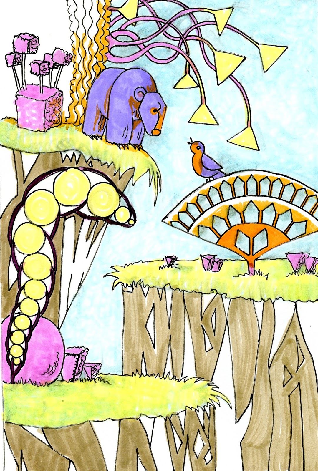
Next I used Dark Olive in the bushes behind the bear and along the cliff. I used the same color in both places, but notice the difference in color. I did scribble when coloring the bushes, allowing yellow to show through, but the Dark Olive is semi-opaque, so the color underneath has more affect.
To finish off, I used Dark Plum over the Dark Olive to get my darkest values, and notice how it turned almost black and doesn't really look green at all. That's opacity versus transparency.
 |
| Scan 17 |
There you have it. I don't plan to go through the coloring phase very often. It's too big of a subject. Perhaps when I've exhausted the possibilities of drawing fantasy landscapes, I'll spend more time on how to color them!
For a full list and links to Fantasy Landscape Step-outs, Step-by-steps, Step-wiselys and guide rules go here.
Thanks for sharing these ideas about using marble in interior design.
ReplyDeleteIrish landscape photography
Ireland scenic views
Natural beauty of Ireland
Wild Atlantic Way
Cliffs of Moher landscape
Irish countryside vibes
Green landscapes of Ireland
Ireland hiking trails
Best landscape spots in Ireland
Emerald Isle nature