
Recently, Exaclair, USA sent me a bottle of “Amethyste de l’Oural” ink for review. The first ink in the new 1798 collection, the packaging reflects the change from the J. Herbin name to Jacques Herbin.
Starting this month, this ink will be arriving in stores.
EDITED: I just found a giveaway at the Quo Vadis blog. Three winners will receive a bottle of this ink. The giveaway ends on Aug 15. You can enter the giveaway here.

Look and feel
“Amethyste de l’Oural” translates as Amethyst of the Ural Mountains, and it's inspired by the gemstone trade of the 16th and 17th centuries. Amethyst stones from Russia, Brazil and Sri Lanka were highly valued for their meditative properties.
This ink is a deep, rich purple with a silver sheen. It shades from a medium-light purple to almost black. The amount of shading depends on the pen and nib. There are sparkles. Nothing unicorn-ish about them though. They aren't aggressively glitterly and even though I managed to get the ink on my hands, I didn't get anything sparkly on them. The sparkle is very subtle and most people won't even notice unless the light hits the page is just the right way.
The 1798 ink is similar to the 1670 inks in depth and viscosity. Pen, paper and humidity make a big difference in the lay down of ink flow, but based on my tests, I'd call this a medium wet ink. It flows nicely but it is easy to control the saturation.
Though the new look is also similar, the bottle is slightly larger with a wider opening, a darker wax seal, and a sticker with the ink name.

The Jacques Herbin logo is engraved on the bottom of the bottle.

The 1798 box is quite different, a grey box, plain except for a sticker and logo, as opposed to the white 1670's box with doodles.

Performance
Writing Examples

I splattered some of the ink on the page. I still couldn't scan the sparkles but you can see how the sheen glows in saturated areas.

Drawing Examples
Since I test and experiment with many products, I create what I call practice pages. I use one product on a page, just noodling around. The next time I play with another product, I just layer over or work around my last practice. I seldom share these pages because they are usually a hot mess, but sometimes they look rather cool. That happened when I started testing this ink.
To get a feel for the flow and look, I worked around some magenta lettering practice and black brush pen ink on a practice pages. Three things immediately became apparent:

Seeing how nicely the purple went with the magenta, I had a suspicion, so I went to another practice page where I had used both water-based marker and ballpoint pens.
My suspicion was right - despite its dark value, Amethyste de l’Oural is rather translucent. Even where I saturated the most, the ink allows hints of the color beneath, but it conceals most detail.
It is also a color that makes others colors pop. It would be a great ink for drawing or writing on colored paper.
In case you are wondering how much ink it takes to cover an area like this - the journal page was 5.5 x 8.3 in (14.8 x 21 cm) and I used a Lamy Safari with a broad nib. The paper is Clairefontaine, formulated for fountain pen. It took just a smidge more than one full pen's worth to ink the page.
(If you are interested in this technique, I have a step-by-step coming up on 8/3 that shows you how to do it).

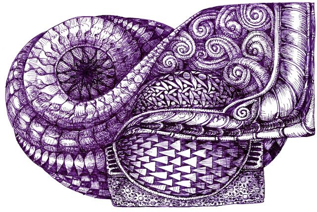
The shading quality of this ink creates an automatic sense of light and shadow. With the broader nibs it is almost as dark as most black drawing pens, and a bit warmer in color. With a finer nib you can get lighter values - almost like switching colors. It suits my drawing style very well. This example was done on ivory dot grid paper.

I drew the second example on a white multi-technique paper. The results were about the same, though it was easier to get the lighter values. This is a softer, toothier paper that saturates more easily so I think that made a difference.
Overall
The new Jacques Herbin 1798 packaging is an improvement with the wider bottle opening, allowing greater ease in dipping your pen.
The Amethyste de l’Oural fountain pen ink is a deep purple with a silver sheen. The nib you use makes a distinct difference in the color of ink and shading, with a range from almost black to a medium value purple. Even with an extra fine nib you get some shading.
Personally. I feel it produces an elegant writing color but I love it more for drawing. The shading qualities make it almost like using two or three colors of ink and it produces a light and shade effect that I find appealing.
Disclaimer: I received this bottle of Amethyste de l’Oural fountain pen ink from Exaclair USA for purposes of a review. I received no other compensation.
Starting this month, this ink will be arriving in stores.
EDITED: I just found a giveaway at the Quo Vadis blog. Three winners will receive a bottle of this ink. The giveaway ends on Aug 15. You can enter the giveaway here.

Look and feel
“Amethyste de l’Oural” translates as Amethyst of the Ural Mountains, and it's inspired by the gemstone trade of the 16th and 17th centuries. Amethyst stones from Russia, Brazil and Sri Lanka were highly valued for their meditative properties.
This ink is a deep, rich purple with a silver sheen. It shades from a medium-light purple to almost black. The amount of shading depends on the pen and nib. There are sparkles. Nothing unicorn-ish about them though. They aren't aggressively glitterly and even though I managed to get the ink on my hands, I didn't get anything sparkly on them. The sparkle is very subtle and most people won't even notice unless the light hits the page is just the right way.
The 1798 ink is similar to the 1670 inks in depth and viscosity. Pen, paper and humidity make a big difference in the lay down of ink flow, but based on my tests, I'd call this a medium wet ink. It flows nicely but it is easy to control the saturation.
Though the new look is also similar, the bottle is slightly larger with a wider opening, a darker wax seal, and a sticker with the ink name.

The Jacques Herbin logo is engraved on the bottom of the bottle.

The 1798 box is quite different, a grey box, plain except for a sticker and logo, as opposed to the white 1670's box with doodles.

Performance
Writing Examples
I inked up three pens with different size nibs and discovered a distinct variation of color with each nib.
The writing from the flex nib was nearly black. With the broad nib the ink shaded from medium-light to dark purple, and the extra-fine nib produced medium-light writing with hints of the darker purple. When I drew saturated squares of color, the ink evened out to dark purple with all three pens, though you can still see a slight difference in color.
Obviously, an ink where you can control color through the choice of pen.

I splattered some of the ink on the page. I still couldn't scan the sparkles but you can see how the sheen glows in saturated areas.

Drawing Examples
Since I test and experiment with many products, I create what I call practice pages. I use one product on a page, just noodling around. The next time I play with another product, I just layer over or work around my last practice. I seldom share these pages because they are usually a hot mess, but sometimes they look rather cool. That happened when I started testing this ink.
To get a feel for the flow and look, I worked around some magenta lettering practice and black brush pen ink on a practice pages. Three things immediately became apparent:
- Amethyste de l’Oural is a beautiful twilight color due to the silver sheen that peeps out here and there.
- It allows a range of values from medium-light to almost black.
- I was using ivory colored paper and this ink made it seem more yellow than usual. Purple and yellow are complimentary colors so I didn't find that surprising.

Seeing how nicely the purple went with the magenta, I had a suspicion, so I went to another practice page where I had used both water-based marker and ballpoint pens.
My suspicion was right - despite its dark value, Amethyste de l’Oural is rather translucent. Even where I saturated the most, the ink allows hints of the color beneath, but it conceals most detail.
It is also a color that makes others colors pop. It would be a great ink for drawing or writing on colored paper.
In case you are wondering how much ink it takes to cover an area like this - the journal page was 5.5 x 8.3 in (14.8 x 21 cm) and I used a Lamy Safari with a broad nib. The paper is Clairefontaine, formulated for fountain pen. It took just a smidge more than one full pen's worth to ink the page.
(If you are interested in this technique, I have a step-by-step coming up on 8/3 that shows you how to do it).


Overall
The new Jacques Herbin 1798 packaging is an improvement with the wider bottle opening, allowing greater ease in dipping your pen.
The Amethyste de l’Oural fountain pen ink is a deep purple with a silver sheen. The nib you use makes a distinct difference in the color of ink and shading, with a range from almost black to a medium value purple. Even with an extra fine nib you get some shading.
Personally. I feel it produces an elegant writing color but I love it more for drawing. The shading qualities make it almost like using two or three colors of ink and it produces a light and shade effect that I find appealing.
Disclaimer: I received this bottle of Amethyste de l’Oural fountain pen ink from Exaclair USA for purposes of a review. I received no other compensation.
Comments
Post a Comment