
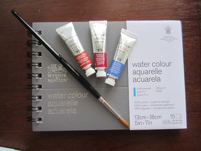
July was World Watercolor Month and Charlie O’Shields at Doodlewash® helped watercolor artists celebrate by hosting several giveaways during the month. I had the incredible luck of winning, not one, but two (!) of the giveaways. I'm still waiting for one of my prizes, but last week I received my Winsor & Newton prize package. I want to thank Charlie and Winsor & Newton. My package was sent through Colart, so I'll add them to the 'Thank you' list as well.
I received three 5 ml tubes of Winsor & Newton Professional watercolor along with a size 4 round Series 7 brush, and 5 x 7 (13 cm x 18 cm) Winsor & Newton watercolor pad. A nifty little set!
So, of course, I have to do a review. It's what I do!
Since I'm reviewing all the items, I won't go into much depth for any of them, and I'm only using the items in the set. Results will differ to some degree when using other papers or brushes. I have enough experience with Winsor & Newton paint to know that my results were pretty standard.
The Watercolors
The three colors I received are Burnt Sienna (PR101), Alizarin Crimson (PR83), and French Ultramarine (PB29). This isn't a bad triad, though I think I'll add some of the Winsor & Newton Yellow Ochre that I already own to this palette, so that I can create more greenish greens.

I played around with the three colors, just mixing them to see what range of colors I could create. I wish I could say that my crowded calligraphy came about because I was seeing what range of lines I could get with my new brush, but ... no. Wait! ... that's a pretty good story. I'll stick with that, lol.
All joking aside, you can get a good range of colors - some very nice neutrals and purples, especially.
The three pure colors are on the top left, and all the rest of them are the result of mixing two or all three of the pigments.

After doing my little chart, I did a wet-into-wet abstract painting, to let the colors do their thing with each other. It looks a little bit like some kind of mystery house thingy, but it does show some of the range of values from light to dark.
I really like the way the burnt sienna and french ultramarine interact and granulate. They make great earth tones.

The burnt sienna has an light value, the french ultramarine is about middle of the road and the alizarin crimson is very powerful and staining. I had to be careful in the mixing that it didn't overpower the other two.
I like the difference in the value of the pigments because I think it gives you more range. At its lightest the burnt sienna has definite yellow overtones, but they don't translate to greens with the french ultramarine. I know from experience that it will create greens with some blues, though they are brownish greens.
Because burnt sienna and french ultramarine are granulating colors, they need more coaxing to get them to move in water, while the alizarin crimson explodes on the page and moves freely. That is standard with these colors, and these Winsor & Newton pigments were true to that. That said, I didn't need to coax too much, and the alizarin was fairly easy to control.
The Series 7 Brush
The Series 7 brush is a Kolinsky Sable Brush with a rust-proof, seamless nickel plated ferrule and black polished handles. The Winsor & Newton name, size, series, the words finest sable and England are on the handle in gold print.

This is a fairly soft brush that carries a decent load of water and pigment. Definitely in the professional range, though I have other brushes that hold more water and pigment. They cost much more, however.

The brush snaps to a good point. While the size 4 round is smaller than I use regularly for washes, I was able to cover the 5 x 7 page, evenly, and yet paint lines indicating tiny branches on a tree. The bristles are a bit soft for lifting, but I was able to do a decent job of it.
The lightest values in the painting below are all lifted. The clear blue area were lifted with kleenex while the painting was still wet. However, the upper area of the painting got muddy because I deliberately painted, let dry, lifted and then repainted three times to see how well the paper held up - more about that below. You can see the transparency and richness of the color at the bottom, where I only lifted one area with a kleenex while the paper was still wet. This painting also shows that you can achieve a value close to black when mixing all three colors together.

The Winsor & Newton Watercolor Pad
I received a 5 x 7 inch wire-bound watercolor pad. I'm a bit torn. This is such a nice size for doing color charts that I'm tempted to use it for that, but the paper really a bit too nice to use that way. I've never used the Winsor & Newton paper before, and I will use it again in the future.

The pad is filled with Winsor & Newton's 100% cotton cold-pressed (NOT), fine grain, 140 lb., surface mould-made paper. The photo below shows the texture, but it's an extreme close-up. To the eye, the paper is not so rough. It's just the texture I like. Rough enough for some granulation, but the texture doesn't get in the way of your brush strokes.

Although the pad size is 5 x 7 inch, it is wire-bound so you lose about 1/8 of an inch in the width and the perforation that allows you to tear off your paintings without risk of tearing. I tore a page out just to test and it came free easily.

For another test, I spread a small area of masking fluid on the page and painted a blue wash over the entire page. After removing the masking fluid, I painted over it to see if the paper took the pigment. It did, with no apparent damage to the paper.
Then I liberally sprinkled masking fluid all over the bottom of the page. I painted, let dry and painted then repeated, carving out some negative shapes. I let the painting sit for a couple of days before I removed all the masking fluid. This was another test. The longer masking fluid sits on the paper, the more likely it will cause damage.
I had no problem removing the masking fluid however. I painted a few of the previously masked areas to see if it would still take color or show signs of damage. It did take color quite well, and there was no noticeable damage.
I kind of like the effect I got with the splattered masking fluid. I'll have to play with that some more.

I also lifted paint with the brush, though I didn't scrub to the extent that I did in my tree painting. I did manage to cause damage in the upper areas of the tree painting but I was trying to. I like to see how much I can scrub and lift, because I tend to do it a lot. I felt the paper held up well to my abuse.
It actually looks better in real life - the scan picked up the micro-damage where bits of paper had been lifted away.

Now that I'd played around and tried to destroy the paper, I did a quick wet-into-wet study. This was inspired by an exercise in one of Hazel Soan's watercolor books. See that blob in the upper left corner that looks like I accidentally stuck my thumb into the paint? No. That's the eclipse. Another good story I'm sticking with!

I was so thrilled to win this prize package, and I'm looking forward to filling up my water color pad with paintings!
Be sure to visit Doodlewash for reviews, guest artist reviews, giveaways and more. Charlie also runs the World Watercolor Group on Facebook.
I received three 5 ml tubes of Winsor & Newton Professional watercolor along with a size 4 round Series 7 brush, and 5 x 7 (13 cm x 18 cm) Winsor & Newton watercolor pad. A nifty little set!
So, of course, I have to do a review. It's what I do!
Since I'm reviewing all the items, I won't go into much depth for any of them, and I'm only using the items in the set. Results will differ to some degree when using other papers or brushes. I have enough experience with Winsor & Newton paint to know that my results were pretty standard.

The Watercolors
The three colors I received are Burnt Sienna (PR101), Alizarin Crimson (PR83), and French Ultramarine (PB29). This isn't a bad triad, though I think I'll add some of the Winsor & Newton Yellow Ochre that I already own to this palette, so that I can create more greenish greens.

I played around with the three colors, just mixing them to see what range of colors I could create. I wish I could say that my crowded calligraphy came about because I was seeing what range of lines I could get with my new brush, but ... no. Wait! ... that's a pretty good story. I'll stick with that, lol.
All joking aside, you can get a good range of colors - some very nice neutrals and purples, especially.
The three pure colors are on the top left, and all the rest of them are the result of mixing two or all three of the pigments.

After doing my little chart, I did a wet-into-wet abstract painting, to let the colors do their thing with each other. It looks a little bit like some kind of mystery house thingy, but it does show some of the range of values from light to dark.
I really like the way the burnt sienna and french ultramarine interact and granulate. They make great earth tones.

The burnt sienna has an light value, the french ultramarine is about middle of the road and the alizarin crimson is very powerful and staining. I had to be careful in the mixing that it didn't overpower the other two.
I like the difference in the value of the pigments because I think it gives you more range. At its lightest the burnt sienna has definite yellow overtones, but they don't translate to greens with the french ultramarine. I know from experience that it will create greens with some blues, though they are brownish greens.
Because burnt sienna and french ultramarine are granulating colors, they need more coaxing to get them to move in water, while the alizarin crimson explodes on the page and moves freely. That is standard with these colors, and these Winsor & Newton pigments were true to that. That said, I didn't need to coax too much, and the alizarin was fairly easy to control.
The Series 7 Brush
The Series 7 brush is a Kolinsky Sable Brush with a rust-proof, seamless nickel plated ferrule and black polished handles. The Winsor & Newton name, size, series, the words finest sable and England are on the handle in gold print.

This is a fairly soft brush that carries a decent load of water and pigment. Definitely in the professional range, though I have other brushes that hold more water and pigment. They cost much more, however.

The brush snaps to a good point. While the size 4 round is smaller than I use regularly for washes, I was able to cover the 5 x 7 page, evenly, and yet paint lines indicating tiny branches on a tree. The bristles are a bit soft for lifting, but I was able to do a decent job of it.
The lightest values in the painting below are all lifted. The clear blue area were lifted with kleenex while the painting was still wet. However, the upper area of the painting got muddy because I deliberately painted, let dry, lifted and then repainted three times to see how well the paper held up - more about that below. You can see the transparency and richness of the color at the bottom, where I only lifted one area with a kleenex while the paper was still wet. This painting also shows that you can achieve a value close to black when mixing all three colors together.

The Winsor & Newton Watercolor Pad
I received a 5 x 7 inch wire-bound watercolor pad. I'm a bit torn. This is such a nice size for doing color charts that I'm tempted to use it for that, but the paper really a bit too nice to use that way. I've never used the Winsor & Newton paper before, and I will use it again in the future.

The pad is filled with Winsor & Newton's 100% cotton cold-pressed (NOT), fine grain, 140 lb., surface mould-made paper. The photo below shows the texture, but it's an extreme close-up. To the eye, the paper is not so rough. It's just the texture I like. Rough enough for some granulation, but the texture doesn't get in the way of your brush strokes.

Although the pad size is 5 x 7 inch, it is wire-bound so you lose about 1/8 of an inch in the width and the perforation that allows you to tear off your paintings without risk of tearing. I tore a page out just to test and it came free easily.
For another test, I spread a small area of masking fluid on the page and painted a blue wash over the entire page. After removing the masking fluid, I painted over it to see if the paper took the pigment. It did, with no apparent damage to the paper.
Then I liberally sprinkled masking fluid all over the bottom of the page. I painted, let dry and painted then repeated, carving out some negative shapes. I let the painting sit for a couple of days before I removed all the masking fluid. This was another test. The longer masking fluid sits on the paper, the more likely it will cause damage.
I had no problem removing the masking fluid however. I painted a few of the previously masked areas to see if it would still take color or show signs of damage. It did take color quite well, and there was no noticeable damage.
I kind of like the effect I got with the splattered masking fluid. I'll have to play with that some more.

I also lifted paint with the brush, though I didn't scrub to the extent that I did in my tree painting. I did manage to cause damage in the upper areas of the tree painting but I was trying to. I like to see how much I can scrub and lift, because I tend to do it a lot. I felt the paper held up well to my abuse.
It actually looks better in real life - the scan picked up the micro-damage where bits of paper had been lifted away.

Now that I'd played around and tried to destroy the paper, I did a quick wet-into-wet study. This was inspired by an exercise in one of Hazel Soan's watercolor books. See that blob in the upper left corner that looks like I accidentally stuck my thumb into the paint? No. That's the eclipse. Another good story I'm sticking with!

I was so thrilled to win this prize package, and I'm looking forward to filling up my water color pad with paintings!
Be sure to visit Doodlewash for reviews, guest artist reviews, giveaways and more. Charlie also runs the World Watercolor Group on Facebook.
Comments
Post a Comment